Revive the Reason to Belong
Give members a clear, ongoing answer to “why stay active?”, turning Identity from a yearly reunion into a living, value-driven covenant.
Identity is a global community serving more than 1,000 active members, the “90th Generation,” that started with one simple promise: to stay together after leaving the pondok. Ten years on, it had grown to 40+ chapters across two countries, but the spark was fading. What began as a living covenant was slipping back into a once-a-year reunion, and its visual identity had drifted just as far as the community’s momentum.
I led Identity 2.0 as creative director, and treated it as far more than a new logo. On the outside, I crafted a new-generation identity that members would be proud to wear. On the inside, I built the system that holds it up: a clear structure, a naming logic, and a documented tone of voice that let a small team stay consistent on their own. The point was to make the community better on both fronts, how it looks and how it actually runs.
Give members a clear, ongoing answer to “why stay active?”, turning Identity from a yearly reunion into a living, value-driven covenant.
Replace two rival logos and a dozen ad-hoc posting styles with one recognizable brand and a single, well-documented tone of voice.
Build a flexible sub-brand and chapter system so every city, program, and event still feels like one family, with no designer needed.
On paper, this was a rebrand. In practice, the logo was never the real problem. The community itself had quietly started to fade. So before touching a single pixel, I treated Identity 2.0 as a revival: first understand why the energy was draining, then rebuild the brand as the system that brings it back to life.
Reality 01
A decade after graduation, members are deep in careers, families, and cities of their own. The momentum that once came for free now competes with real, adult life.
Reality 02
Beyond a shared graduation year, the group had drifted into very different worlds. Without a reason to gather that still feels relevant, “being an alumnus” slowly stopped meaning much.
Members couldn’t answer a simple question: “what do I actually get by staying active?” With no visible, ongoing value, showing up became optional.
Programs ran on the goodwill of a handful of people, with no visible structure, roles, or rhythm. Good intentions kept stalling because nobody quite knew who did what.
The community leaned on nostalgia to pull people back, but nostalgia has a ceiling. Once the old memories were relived, there was little reason to return.
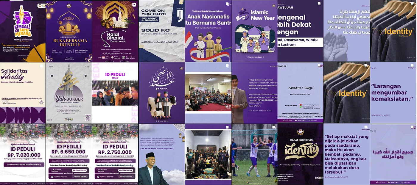
The same community showed up as both “The Identity” and “Identity Generation”, with different logos and vibes. One soul, but two faces, so it never read as a single, recognizable brand.
Every admin posted in their own style. Captions swung from formal to casual, Arabic to slang, so the feed never sounded like one confident, coherent voice.
The programs were genuinely good: football leagues, charity drives, scholarships. But visually they looked unrelated, so all that impact never added up into one story.
Before we get to tactics, this is the mindset shift everything else is built on. The first job isn’t to make 1,500 people care at once. It’s to make 30 people feel alive again, then let that warmth spread.
“Just contribute!” as a demand placed on members
Contribution between members, through concrete collaboration
One story pushed out to all 1,500 at once
Many ways in, each matched to a member’s life stage and interests
Chasing every one of the 1,500 at the same time
Build a small, active core first (30–50 people), then let it spread
City-based chapters that quietly died out
Interest- and profession-based circles, kept warm with light rituals
The USP:
DiversityIf the fear is that “there’s nothing to offer,” let’s look again at what’s already here: real expertise, spread across dozens of cities and a handful of countries, all sharing one root. That is the single most valuable network no other community can claim. What’s missing was never the asset; it’s the switch to turn it on.
The very diversity we’d treated as a weakness is actually the community’s greatest asset, once we switch it on into value that members can genuinely use.
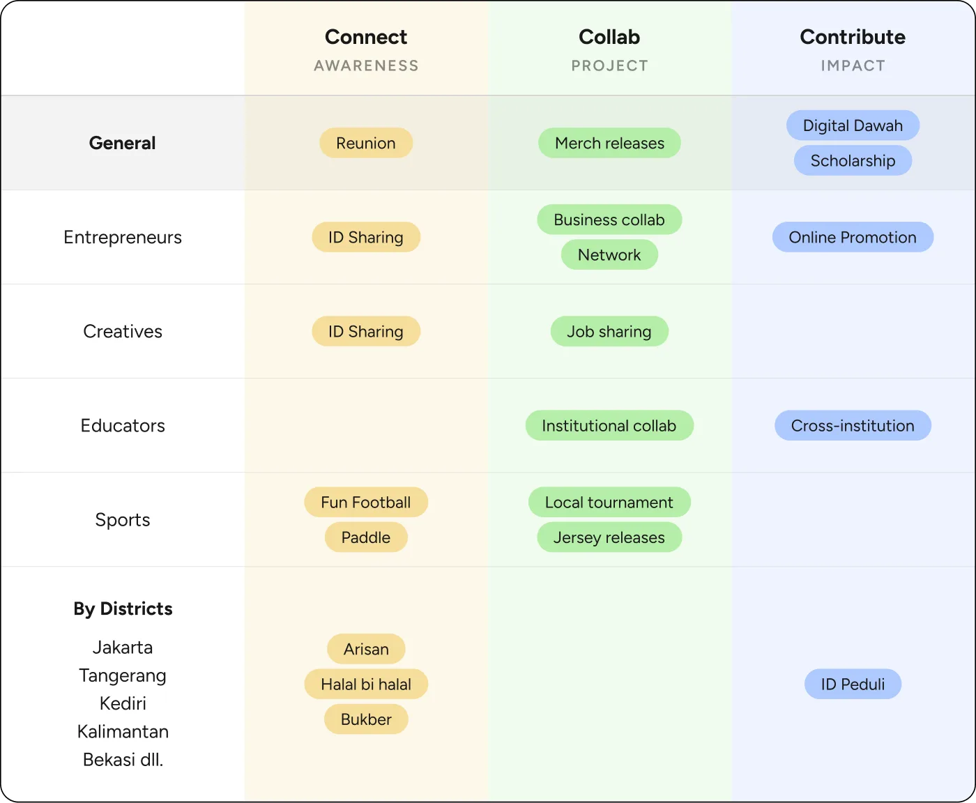
To make the promise usable, I turned those three words into a working framework. Every activity the community runs now maps to one of three intents, so each chapter knows exactly what a program is for, and members know what they’re signing up for.
Awareness
Low-effort touchpoints that keep everyone in the loop: reunions, chapter meetups, and ID sharing that rebuild everyday familiarity.
Project
Members build together through business collabs, job and skill sharing, and cross-institution projects that turn the network into opportunity.
Impact
Turning the network into real impact: scholarships, relief drives, and digital dakwah that give back to the school and the wider ummah.
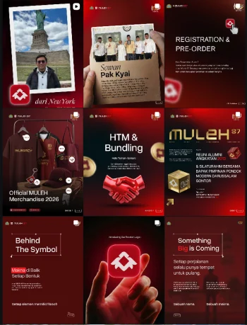
I started close to home, studying how other alumni networks, pesantren communities, and faith-based organisations show up online. I looked at how they introduce themselves, how they run their programs on a feed, and what actually makes people engage rather than quietly scroll past. The pattern was consistent: most lean on formal announcements and group photos, with little visual system holding it together. It confirmed the gap I’d suspected. Almost none of them felt like a modern, living brand a 25-year-old would be proud to reshare.
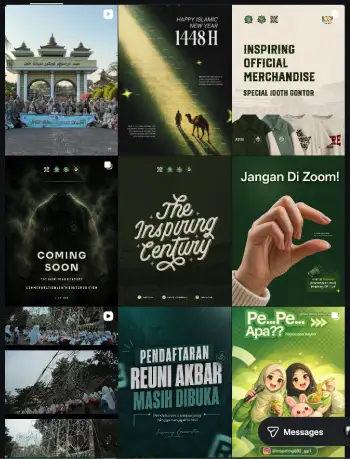
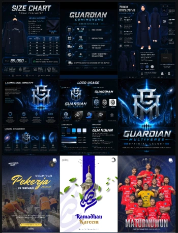
Then I deliberately looked outside the category. I studied youth communities, hospitality brands, global non-profits, and creative studios, borrowing the energy, discipline, and confidence that make people actually want to wear a brand. Four in particular shaped the direction, each for a different reason:
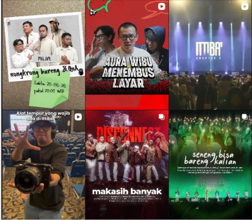
YukNgaji
A youth Islamic movement that posts like a media brand: bold headlines, cinematic photography, and a meme-aware energy. Proof that faith-based content never has to look formal or dusty.
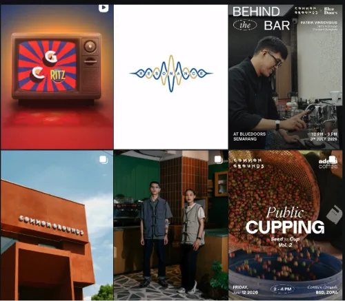
Common Grounds
A coffee brand with ironclad template discipline. From cupping sessions to behind-the-bar features, every post is unmistakably one system, exactly the consistency our feed was missing.
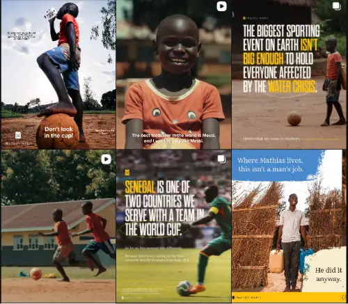
charity: water
A global non-profit that turns contribution into narrative, with bold type over documentary photography that makes impact feel urgent and human, never preachy.
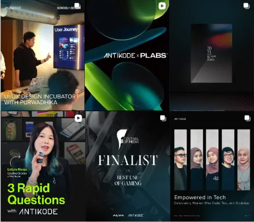
Antikode
A design studio’s digital-first polish: sleek, dark, gradient-driven, and thoroughly current. The exact confidence and craft I wanted the new feed to carry.
From the research, I set three principles to guide every visual decision. The look had to be confident enough to stop a scrolling 25-year-old, yet warm enough to still feel like home. And underneath all three sits the one thing the brand needed most: the whole system had to stay scalable.
01
The brand should feel like a living network, not a static crest. A flexible family of sub-brands and chapters that clearly belong together.
02
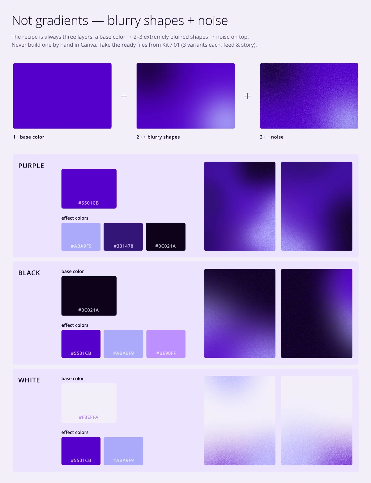
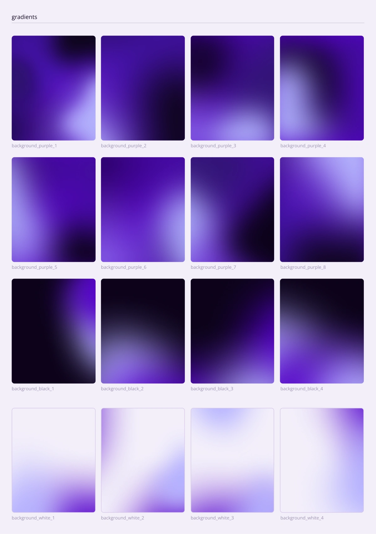
Digital-first and unmistakably now: a bold wordmark, a deep-purple gradient, and grain-and-glow textures that read native on a phone.
03
Human before graphic: real member photography, an inviting voice, and layouts that put people and purpose ahead of decoration.
This is the foundation the other three rest on. Every new chapter, program, and post should stay recognisably Identity, without a designer ever having to be in the loop.
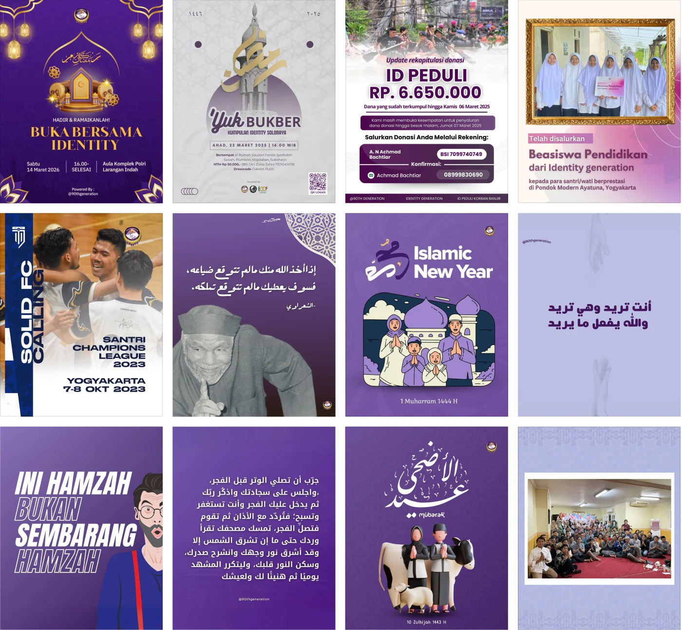
A decade of well-meaning posts, side by side. Every one looks like it came from a different organisation, because in a way it did.
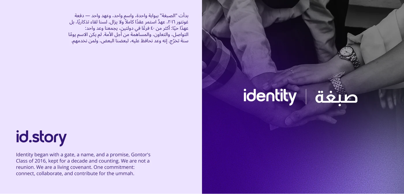
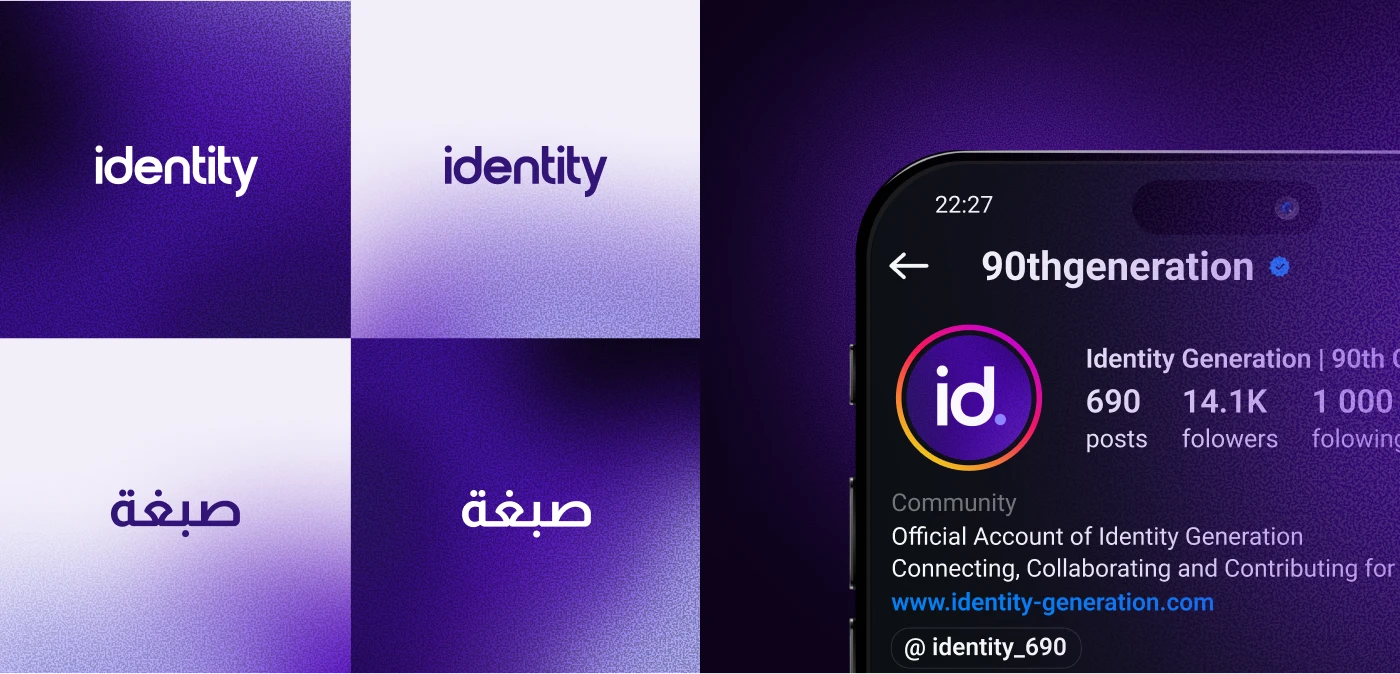
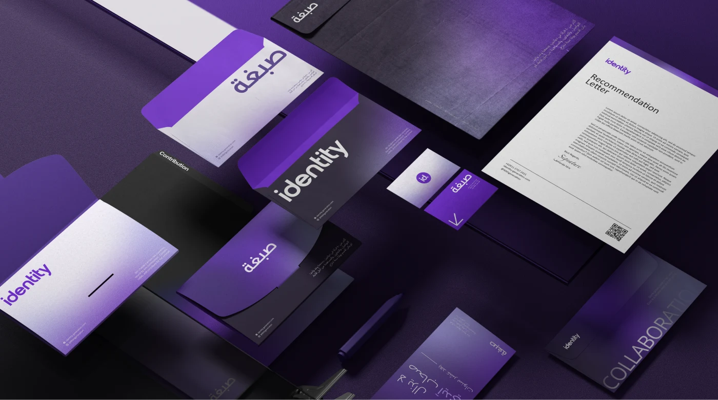
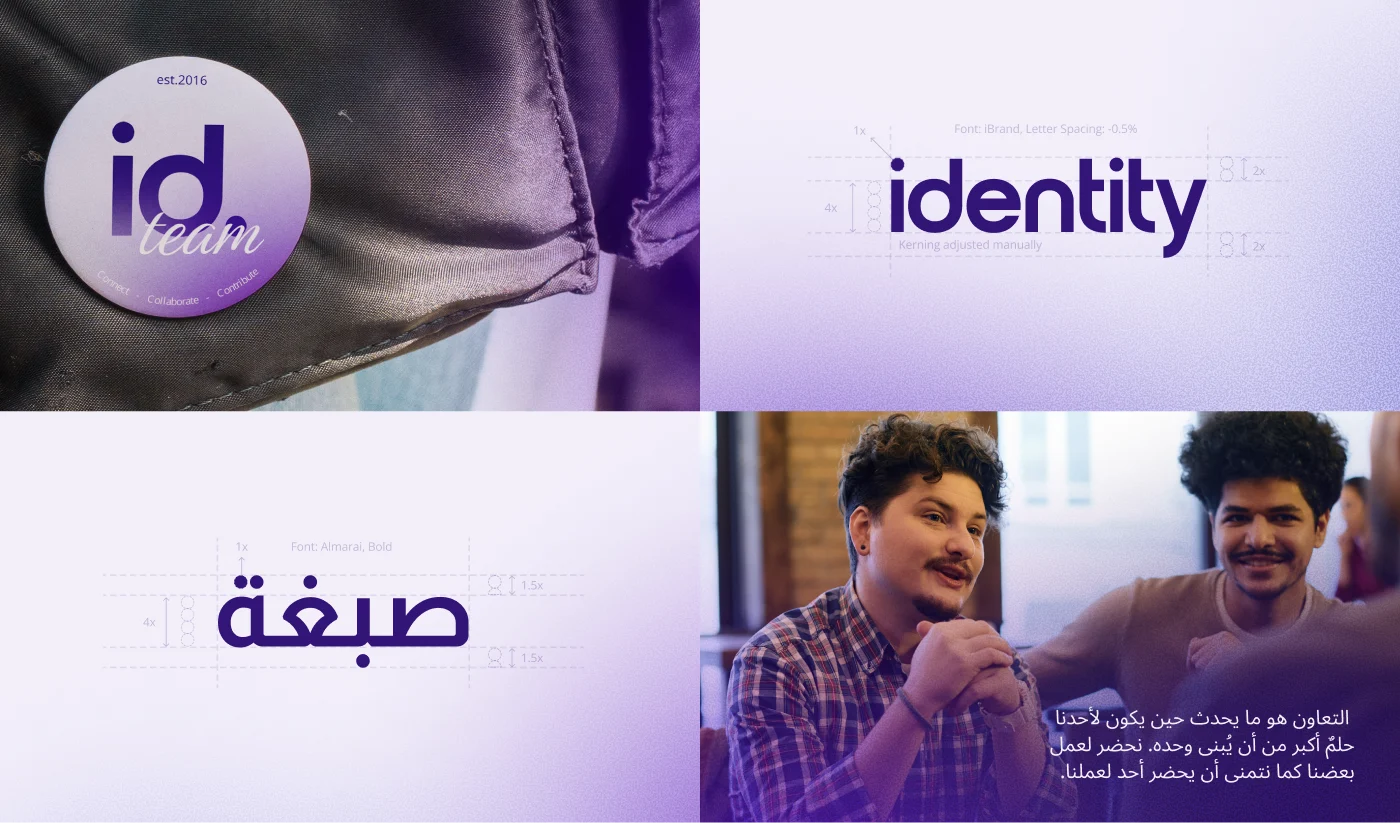
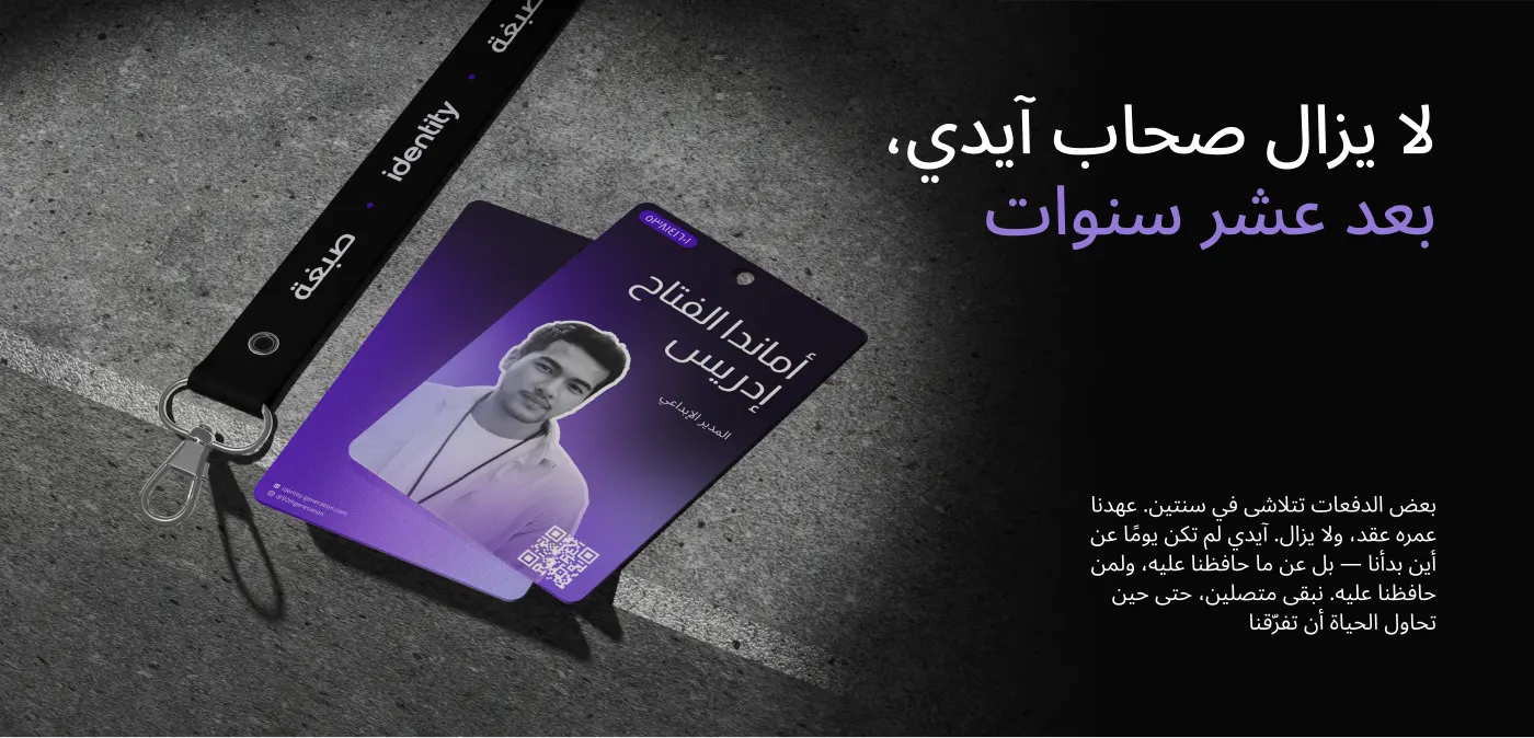
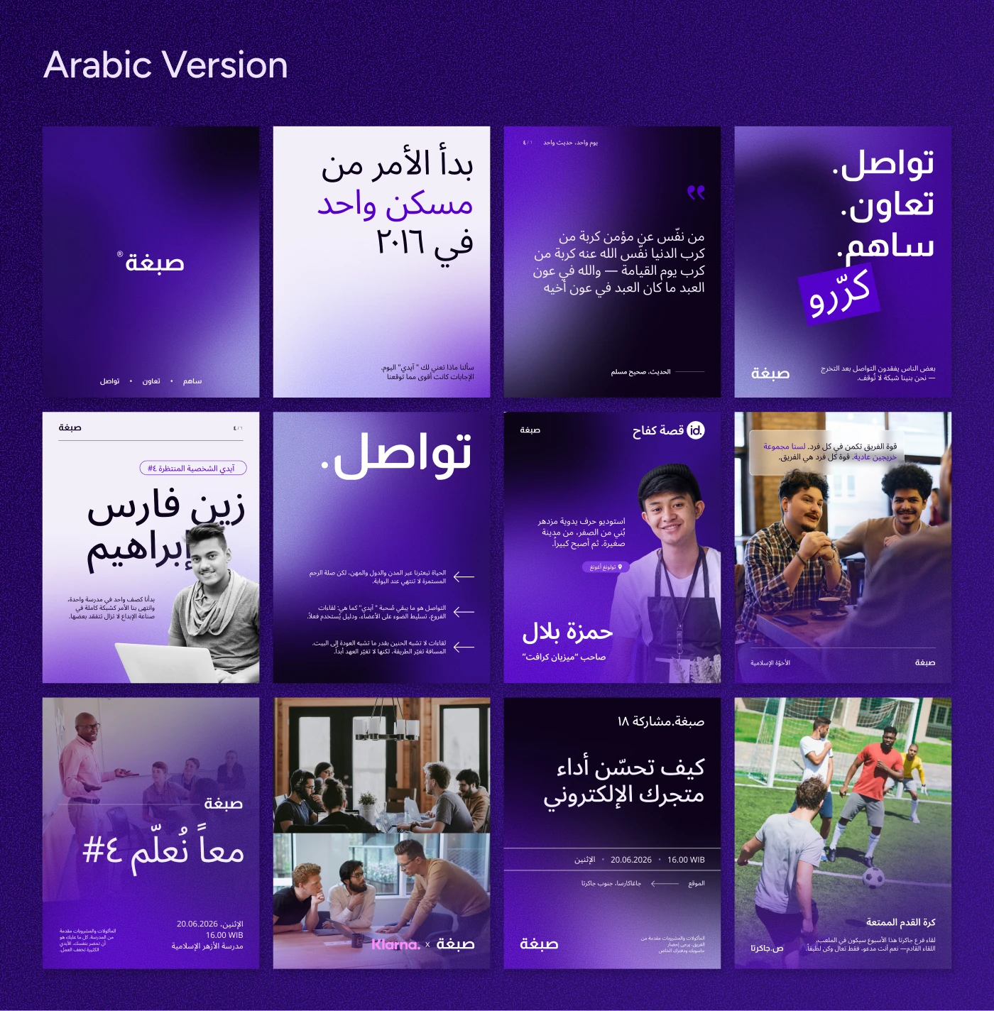
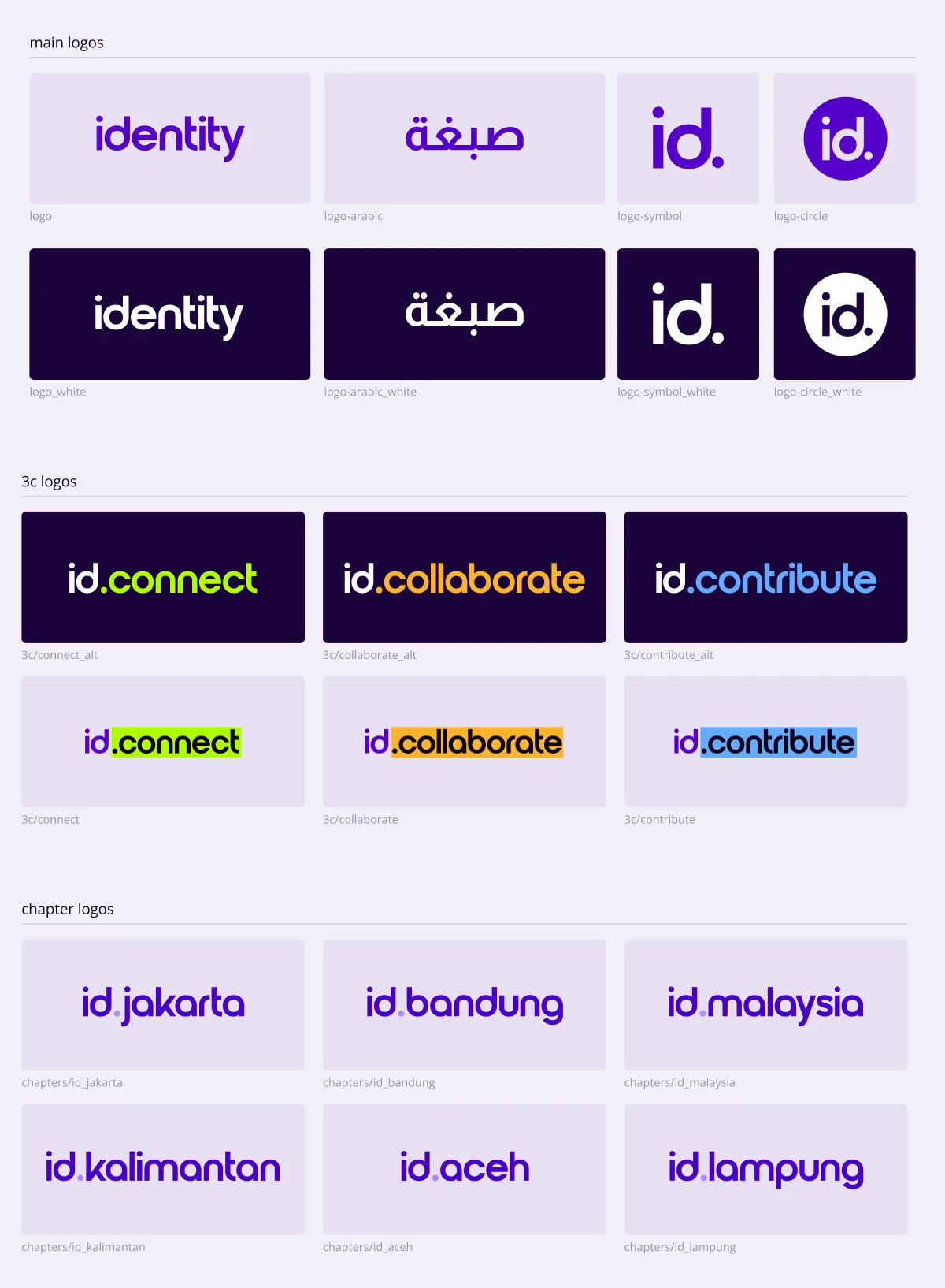
One wordmark in two scripts, one deep-purple world, and one promise: connect, collaborate, contribute. That promise now carries from the logo all the way through to stationery, merchandise, and member ID cards.

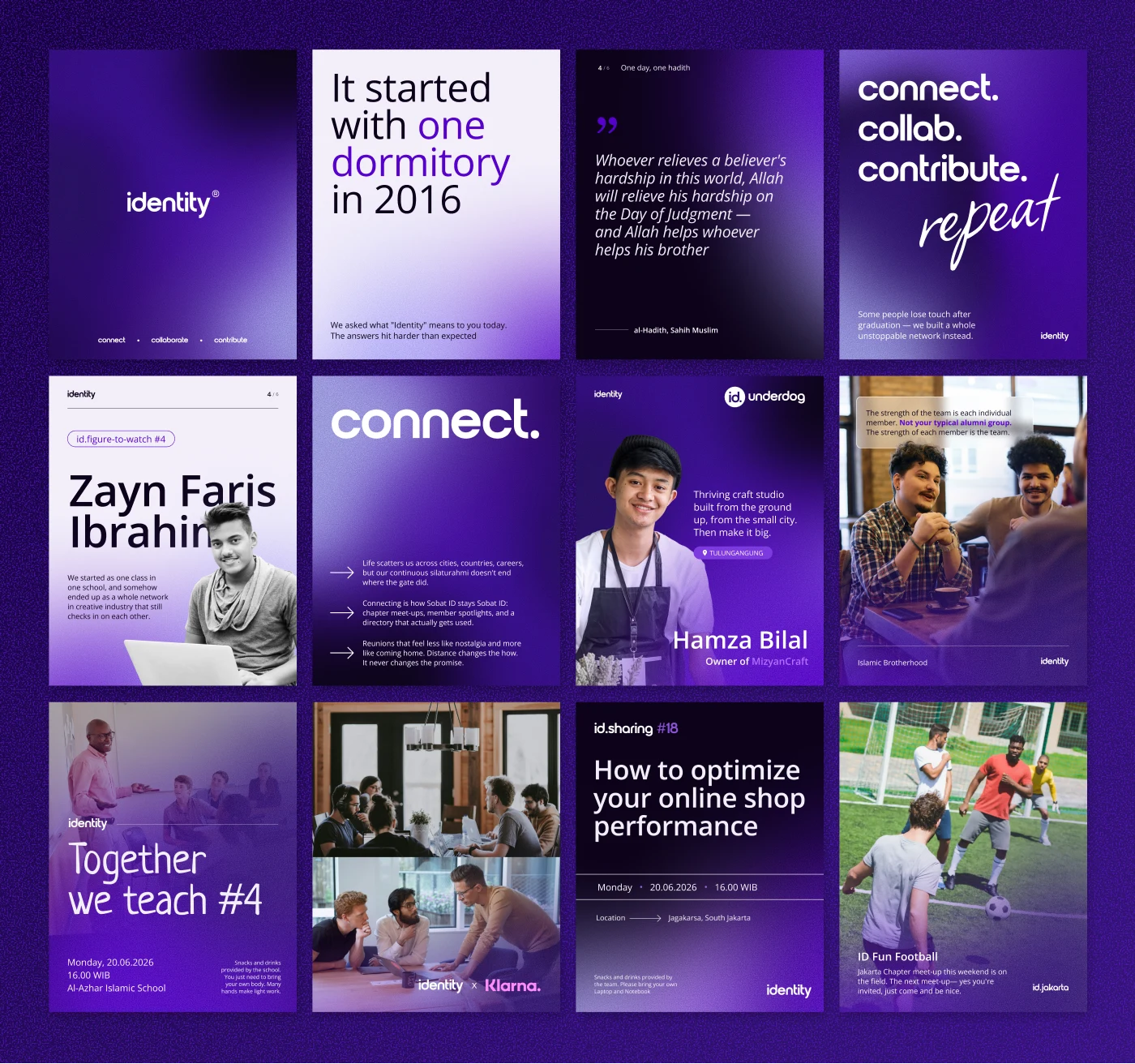
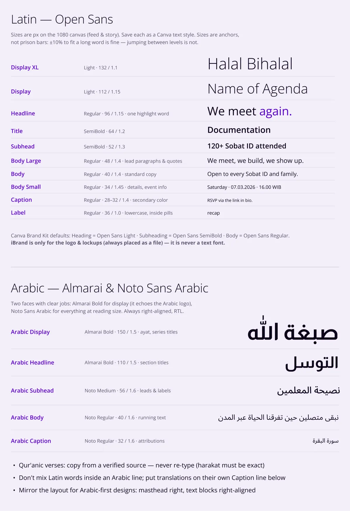
The feed is where the community actually lives, so I rebuilt it as a template system: a consistent grid, a fixed type hierarchy, and reusable layouts any admin can fill in minutes. Now every post finally looks like it belongs to the same voice.
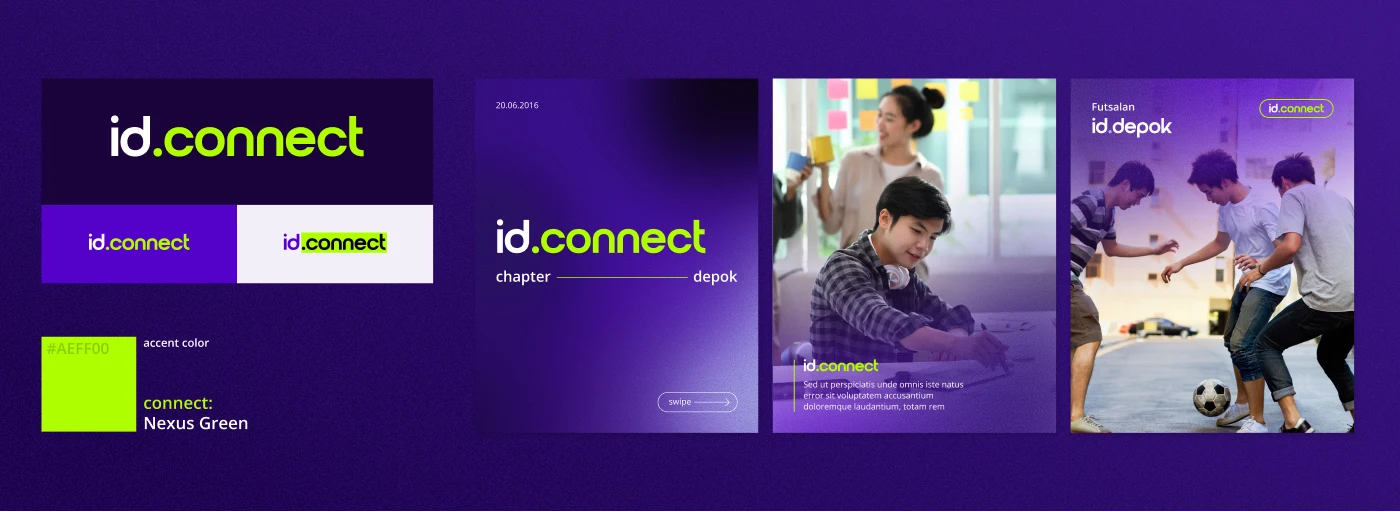
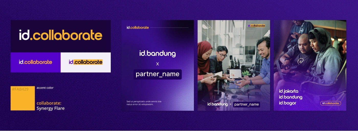
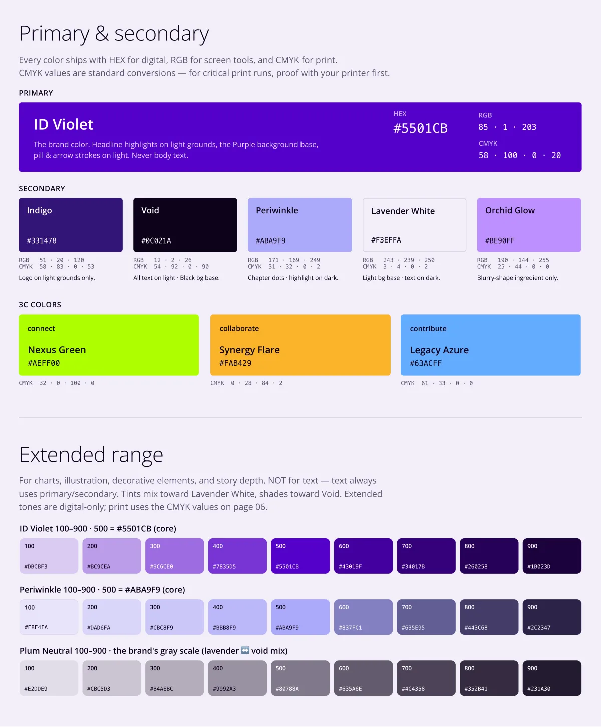
The three intents each became a sub-brand with its own accent colour, a simple, ownable cue that tells members at a glance whether something is about connecting, collaborating, or contributing. The same “id.” naming then stretches to every city chapter and program.
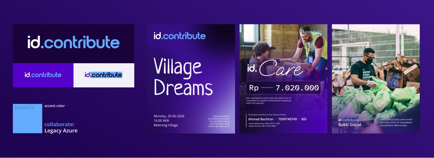
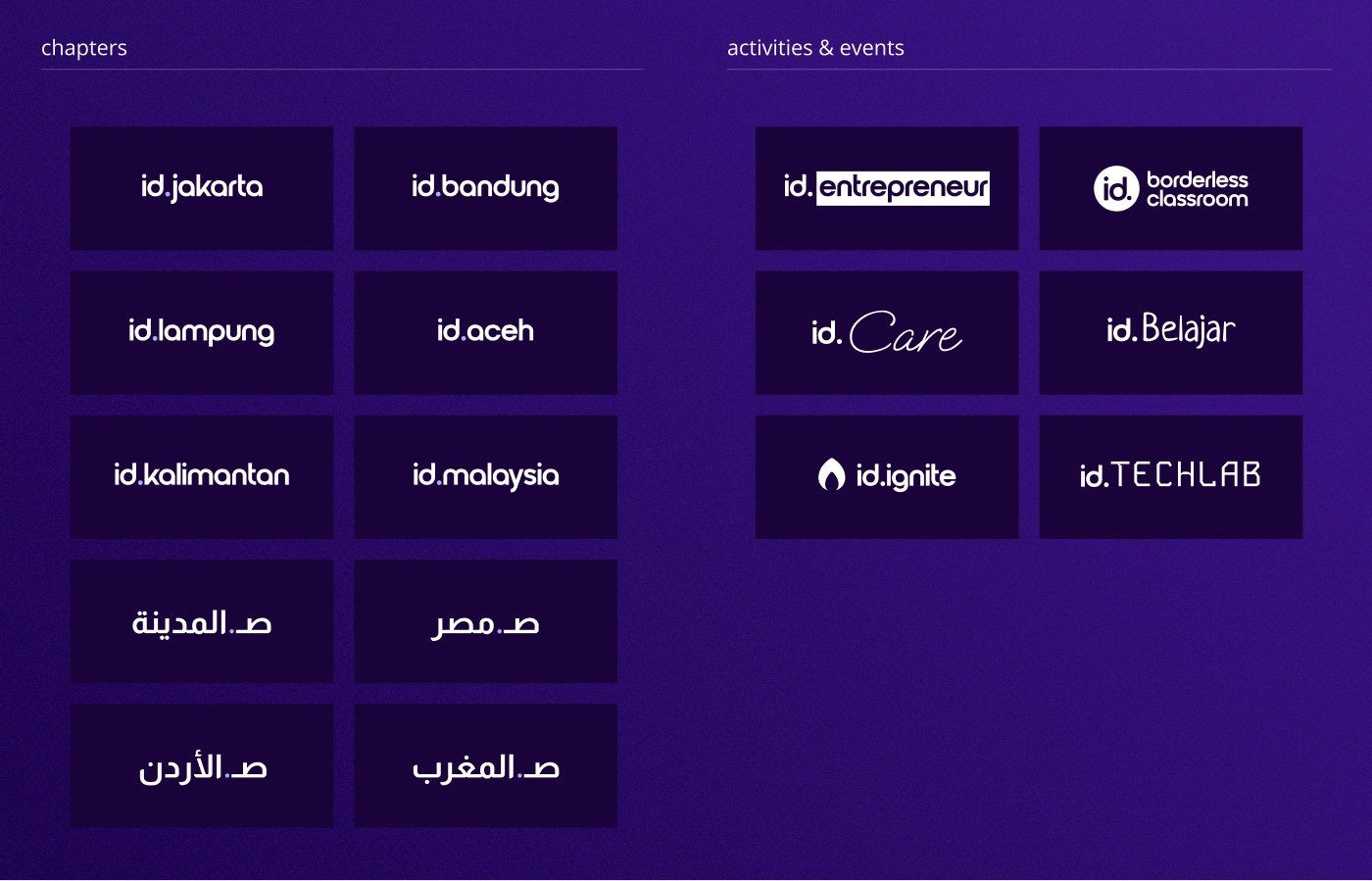
As I’d weighed earlier, the real fix for a scattered brand was never another logo. It was a system the community could run on its own. So the core deliverable became a complete, self-serve brand kit: everything an admin needs to post on-brand, without a designer in the loop.
Note: These previews are pulled from the full Identity 2.0 brand guidelines. The complete, editable source lives with the community’s core team, so here I’m sharing the high-level system rather than every internal page.

A bold creative-hub identity and site for Bacarita, playful typography and a confident grid that gives the studio’s work room to breathe.
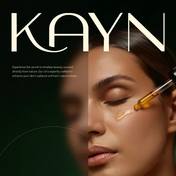
Elevates Kayn Argan Oil with a sophisticated, premium aesthetic that reflects its authentic Moroccan origin with elegant touch to build a strong digital presence.
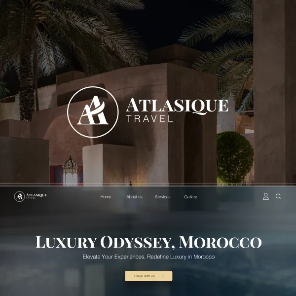
An immersive travel-agency experience for Atlasique, rich imagery and a calm, editorial layout that makes discovering destinations feel like an invitation.