Operational Efficiency
Streamline the transition from Figma to Webflow using responsive components that eliminate the need for manual mobile redesigns.
In my 4th year in Aspire, I was promoted to lead a design team of three. My first major initiative was building a comprehensive design system from the ground up. Previously, our web development workflow was entirely manual, leading to constant friction, inefficient back-and-forth, and a lack of organized assets. I collaborated closely with the website and digital marketing teams to establish a scalable foundation that transformed our production process into a faster and more effective engine for growth.
Streamline the transition from Figma to Webflow using responsive components that eliminate the need for manual mobile redesigns.
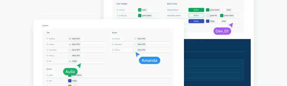
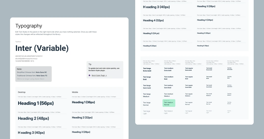
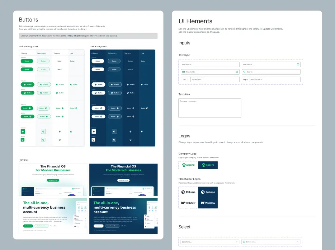
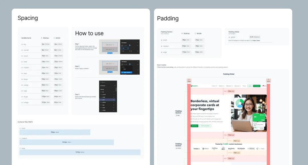
Standardize font styles, spacing, and components into a centralized source of truth to resolve friction between designers and developers.
Establish a robust asset management system that enables bulk updates across 120+ pages while maintaining high performance.
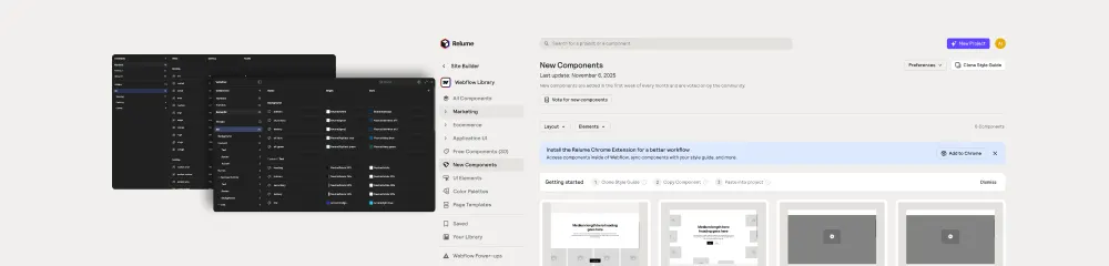
I worked with the website team and digital marketing manager to break down the core issues — ensuring the system would also solve scalability and slow load times, not just the symptoms. Below is a preview of our working files.
Requires 10 working days
for every new page.
With no centralized system, we manually copied elements from old Figma files — dragging simple projects out to nearly two weeks each, with most of it avoidable rework.
Constant confusion over "standard" font styles, spacing, and container sizes forced us to essentially build every new page from scratch.
A total lack of sync with the design team resulted in repeating errors caused by unintentional changes and a struggle to understand existing classes or components.
Development velocity slowed significantly, as a disproportionate amount of time was spent on maintenance and fixing avoidable design-to-dev discrepancies.
I began the building phase by mapping out all the foundational information regarding the tools and frameworks we use across the entire web development process.
Full audit of our existing Figma files to identify recurring patterns within the workflow and elements that needed standardization. Also measuring the baseline production time to build certain pages as a clear benchmark of the old system and workflow.
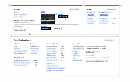
Understanding the sync between Figma features like variables and styles and Webflow classes and tokens to ensure a seamless technical translation from design to code.
I focused on syncable components — build once, update across multiple sites — stress-testing the handoff over several rounds with developers and constantly updating documentation from their feedback to eliminate repeating errors.
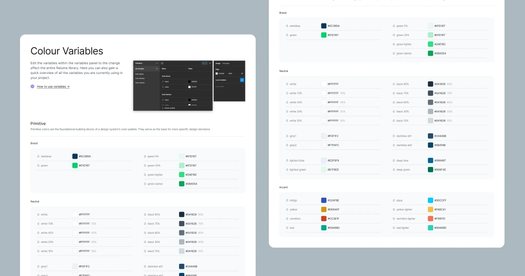
Source
Variables & styles define the single source of truth.
Figma
Library
Standardized, accessible, pre-defined component structures.
Relume
Output
Classes & tokens aligned 1:1 — build once, reuse everywhere.
Webflow
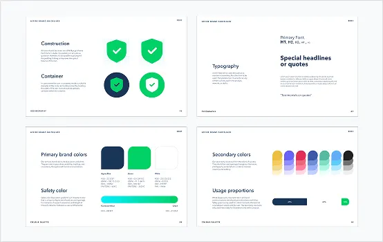
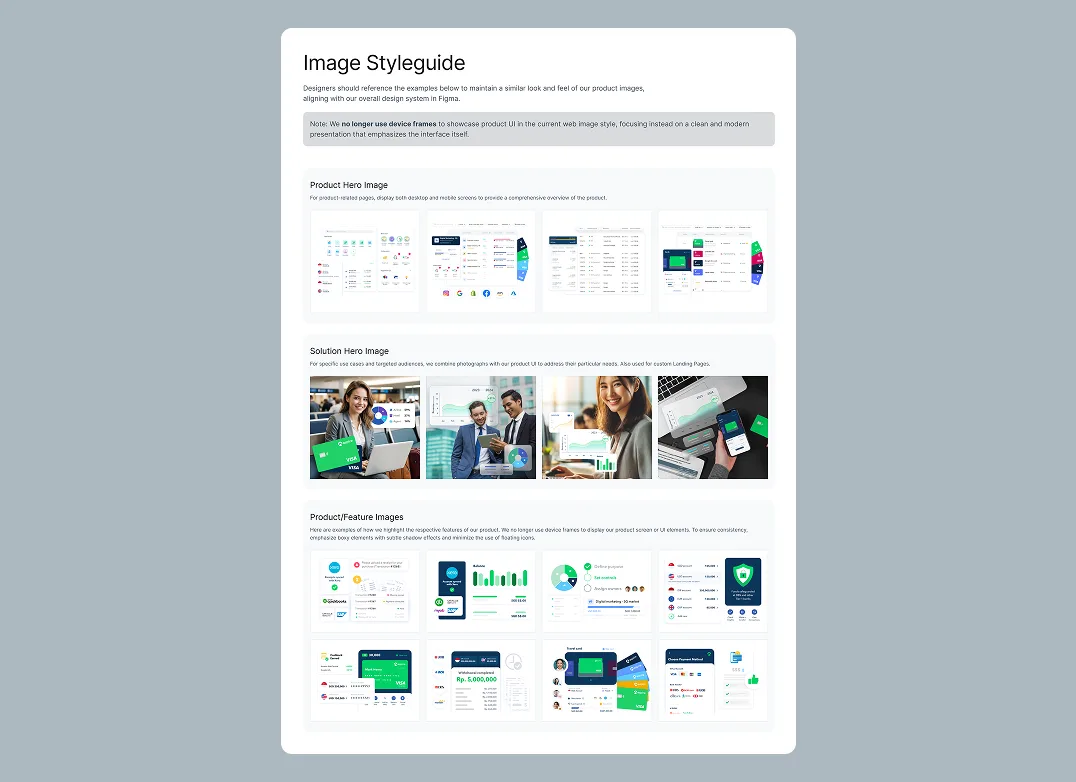
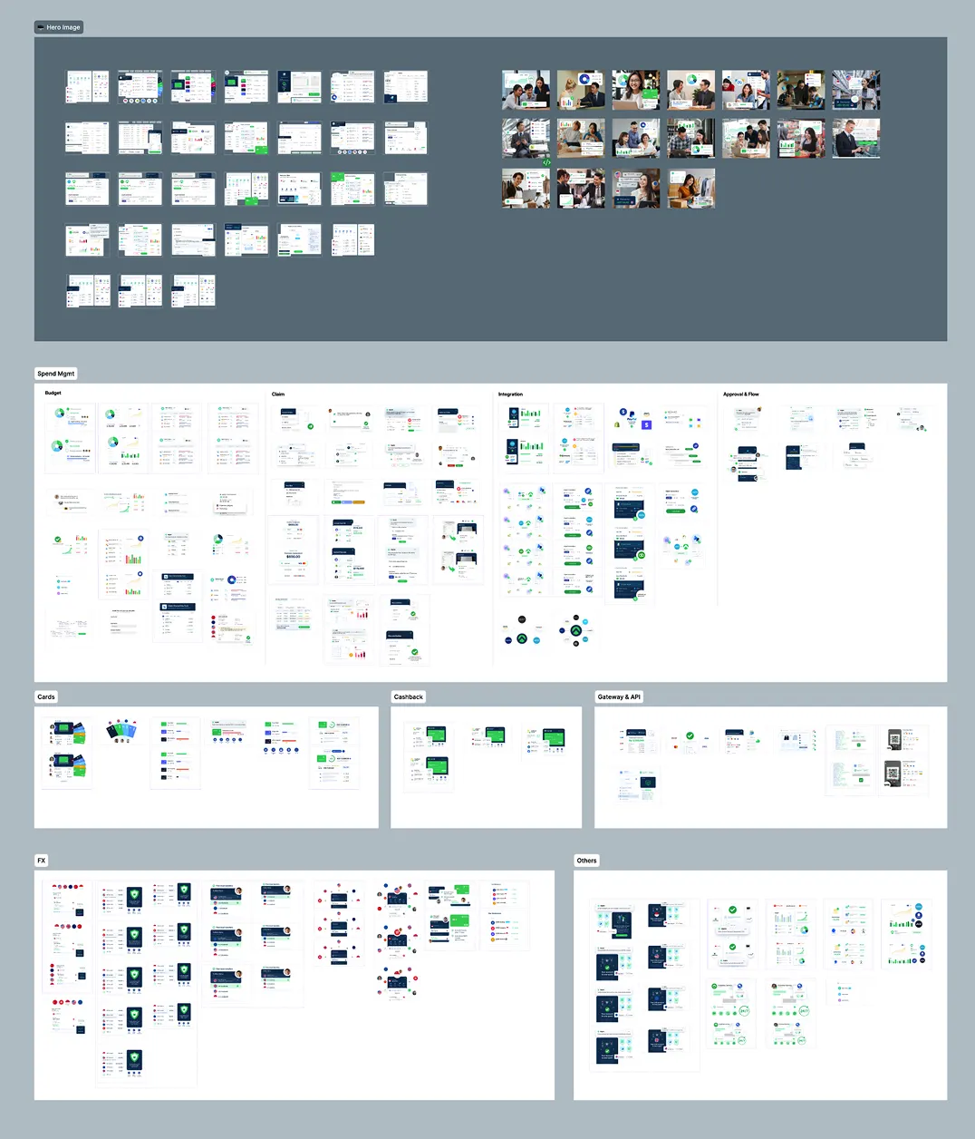
Building the core library using Relume to provide a standardized and well-structured single source of truth.
Running several rounds of iterations with the development team to stress-test the workflow and ensure a truly seamless handoff.
Creating syncable components to allow building once and updating across multiple sites with minimal effort.
Constantly updating the documentation based on team feedback to eliminate repeating errors and ensure the system stays relevant.
2 weeks
of implementation
2 weeks
of refining
It took roughly 2 weeks to complete the final deliverable. After that, we spent another 2 weeks refining the system through continuous iterations before launching it and applying the standards across all 120+ web pages.
Note: Full Figma files are confidential and cannot be shared publicly. Instead, I've provided high-level previews to showcase the system's architecture and core components.
60-75%
Faster production end-to-end
<1second
Page loading time
+67%
CTR on core product pages
What the system actually changed, point by point.

Elevates Kayn Argan Oil with a sophisticated, premium aesthetic that reflects its authentic Moroccan origin with elegant touch to build a strong digital presence.

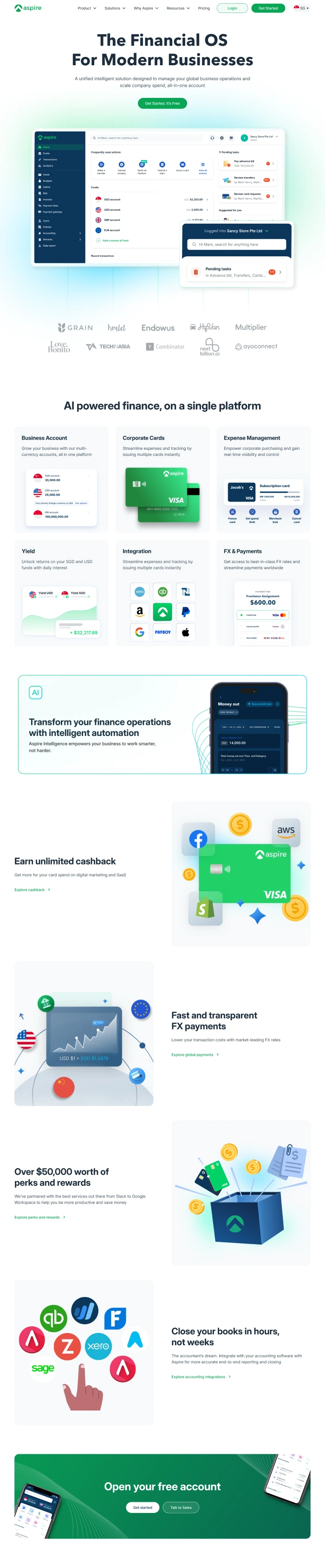
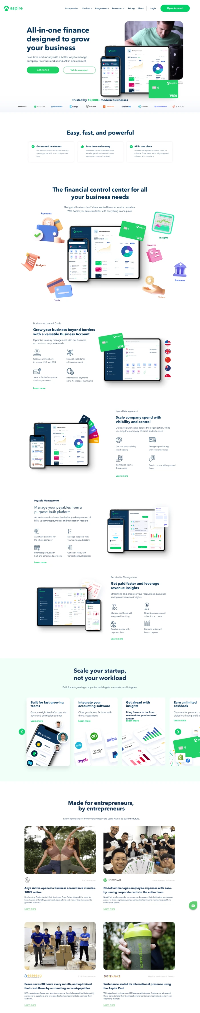
A dedicated landing page that pulls back the curtain on how Aspire actually works, turning complex fintech infrastructure into a clear, transparent narrative that replaces doubt with credibility.

A digital storefront and landing page for NOBI Bakery, where time-honored Japanese baking meets modern flavors, wrapped in a seamless ordering experience for busy city dwellers.